Wednesday, March 16, 2011
WebKing re-design
homepage
about
portfolio
testimonials
pricing
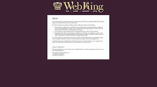
Overall, I am very happy with the way my re-design turned out. The original website was horrible with far too much scrolling and flash-animation. I am really happy with how the logo for the site turned out. It is very simple and easy to read, but the font, Dalliance, gives the 'W' and the 'K' a unique look. I think that all the information is easy to find because it is actually organized.
I like that my design only used purple and gold with black and white. But it also made it hard to create some of the hierarchy because the black and purple were so similar, and the yellow did not work on the white. I don't really like the portfolio page because I had to showcase the WebKing's designs. I tried to find the best designs, but even the ones I chose are still not designed well.
I think it might have been nice to learn how to code the pricing page so that people could actually pay. But since it is not an actual website that might be bad.
posted by Richelle at Wednesday, March 16, 2011 comment here


