Saturday, April 30, 2011
Book Designs
I like the use of typography on the book cover of The Girl who fell from the Sky. The text is mimicking the falling action of the silhouetted girl.
I like the simple design on the cover of
Wet Apples, White Blood. The simple white droplet works to convey both parts of the title.
posted by Richelle at
comment here
New York design
I found these logos for New York that I thought were both interesting. The one on the left uses iconic images within the text to create a memorable logo. The logo on the right uses lines to create a maze and city scape image, which reminds me of the phrase 'the city is a maze'.
Along with the New York theme, I found this design that uses Milton Glaser's famous 'I <3 NY' logo created by Oded Ezer. He wanted to pay homage to Glaser by taking his simple logo and making it more complicated.
posted by Richelle at
comment here
Awesome Logo
I am not a fan of scary movies, but I saw the Fear Net logo on a commercial and immediately liked it. It combines two well known elements that make up scary movies, a blood splatter and a person screaming, that make a unique mark for the company.
posted by Richelle at
comment here
Unique use of Typography
I love this DVD cover for one of my favorite movies. The first time I saw the cover in a store, I really liked the font used for 'The Princess Bride'. Then I realized it could be turned over, and it still reads as the same title.
posted by Richelle at
comment here
Friday, April 29, 2011
Inspiring Designs with The Beatles
I love the Beatles, as any of my friends could tell you. I like to find art that relates to them that has been created by fans. Here are three designs I really love:
I found this ad for a radio station. I love the collage of passport stamps that create the image of Beatles. It is the perfect effect for the image to help convey the tag line "Even though they have not visited every country, their music has."
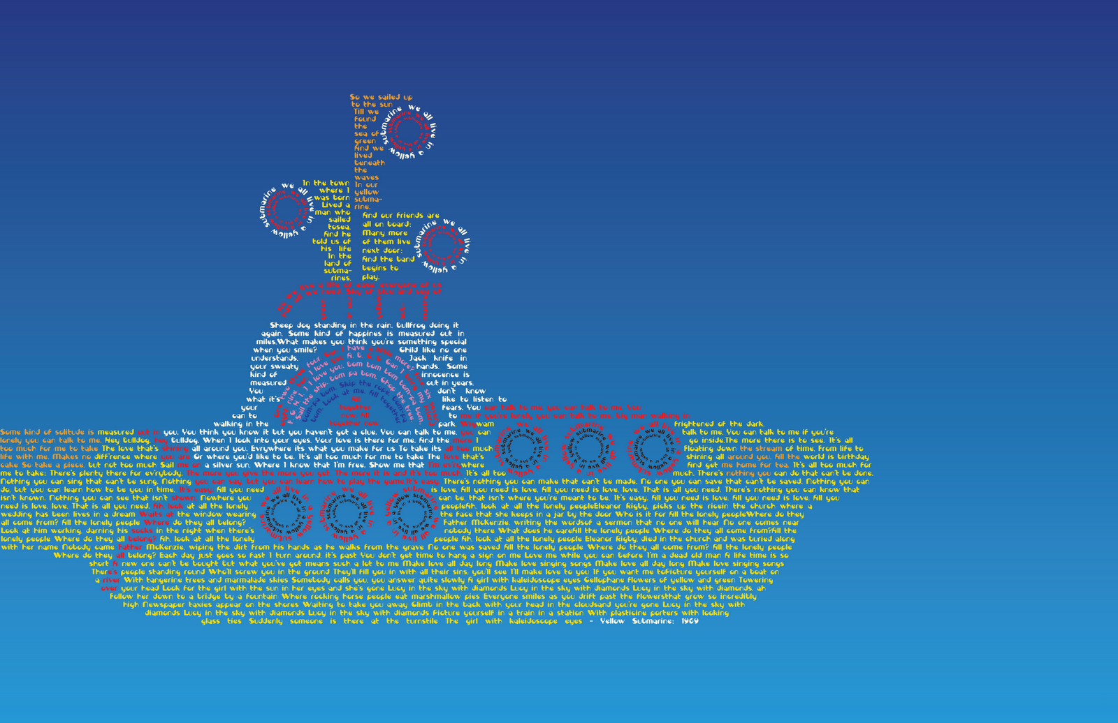
I love typography and finding designs that are created only using fonts. Both of the designs below create the iconic Yellow Submarine using lyrics from Beatles' songs. The first design only uses a line from the song "Yellow Submarine" with some vector images. The second design incorporates the lyrics from several songs used in the "Yellow Submarine Movie". The submarine is created entirely out of text, and the different sections of the submarine are defined by color changes in the font.
Labels: Beatles Art
posted by Richelle at
comment here
John Lennon's 70th birthday logo
John Lennon's self-portrait (pictured above) was used as the inspiration for the logo (below). Ruth Rowland, a Liverpool native, designed the logo for the John Lennon "Gimme Some Truth" Campaign, which commemorated his 70th birthday.
I like Ruth's simplistic twist on such an iconic image to make a simple logo.
posted by Richelle at
comment here
Senior Show Postcards
Here is my postcard design, front and back, for my senior postcard advertising myself in the 'Moravian College Senior Show'. I used elements from my blog and portfolio as inspiration for the postcard design.
posted by Richelle at
comment here
Sunday, April 10, 2011
cute design in New York
I found this store while exploring New York City.
The stores logo is cute but still elegant and clean, which is perfect for their target audience.
posted by Richelle at
comment here
Monday, April 4, 2011
New Look for My Blog
What I like about the project:
- I am really happy with how my blog turned out. I think that the colors and plaid background work well to express me and my design aesthetic. I really like that the bar of the header lines up with the teal line in the plaid design.
What I didn't like about the project:
- I struggled at first to get the images to work on blogger, and I will need to make sure that I move them from my student space before I leave the college.
- I also had some difficulty with the font choice. I tried a couple of fonts to try to find one that was similar to 'century gothic', and I think the font I have now is as close as I can get. I don't quite like the lower case 'y' in the font, but I like how every other letter looks.
-I don't like that the font doesn't work on Firefox, but it can be seen in Safari.
What I wanted to learn more about:
- I really wanted to have buttons on the bottom for 'newer posts' and 'older posts'. I tried to look up the code for them, but I wasn't able to figure it for today.
Images for Blog:
posted by Richelle at
comment here