Penny Lane- my cat

creation process:
title: Penny Lane- my cat
description: The website is about my cat, Penny. It is a place for me to share photographs of Penny, and a place to encourage others to adopt pets from local animal shelters. 
target audience: Cat and pet lovers. Friends and family who have met Penny. 
feature list: When you click on a photo in the photo gallery, I would like for the image to become larger while staying on the same page.  
site map:
      about: A brief biography about Penny, such as her birthday and when and how I got her.
      photo gallery: A place to post a variety of pictures of Penny.
              penny's favorites: This page will have photographs of Penny with her favorite toys.
      adoption center: I would like to include links to animal shelters, so that others can find animals to adopt or support the shelters. I adopted Penny from the Bucks county ASPCA, and I want others to see how wonderful the animals are that are in the shelters. 

home page:

about page:

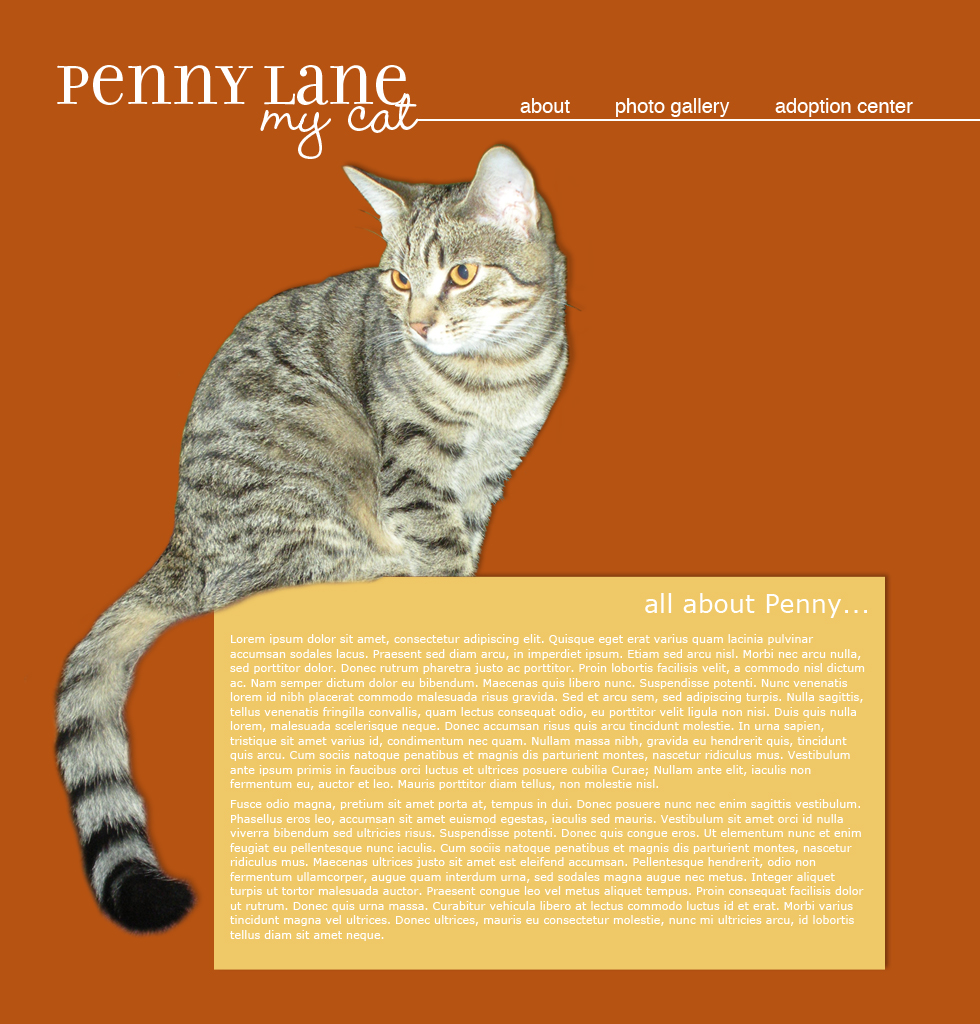
I like how my website is going so far. I only designed the 'home' and 'about' page so far. I had some trouble finding a layout that i like at first, but I am happy with what I came up with. The only effects that I used from what we learned in class was a drop shadow and layer mask on the 'about' page. I think the drop shadows improved the design, so that it didn't look as flat. 

posted by Richelle at comment here

project #1: poster re-designed for the web

original poster:
re-designs:


I found it difficult to create 5 different layouts because I had so few elements to arrange, but I am happy with the simplicity and organization of the posters. I feel like the hierarchy is working in all of the designs. However, I think that the head and subhead on 3 and 4 of the re-designs is difficult to read because of the overlapping, so I think I could improve those layouts by changing the colors. Also, I had difficultly with the placement of the address fitting in with the rest of the design without looking thrown in.

Labels:


posted by Richelle at comment here

In-class redesign

Labels:


posted by Richelle at comment here

10 Websites- a critique

The dieline
http://www.thedieline.com/
overall presentation:
  • The design is clean and simple. Nice color scheme of teal, black, and white. However, the ads along the side get confused with the actual work being displayed.

usability:
  • The website is simple to use and clearly labeled. However, some of the links to the designs don't work, it is hard to find past designs.
organization:
  • Nice hierarchy- logo is prominent followed by the titles of the articles. The designs are broken into categories that make it easier to find designs that relate. 


Yahoo!
http://www.yahoo.com/
overall presentation:
  • There are a lot of ads and lots of stuff to look at.

usability:
  • The website is easy to use. They are trying to target a large audience, so there is a lot of different information presented.
organization:
  • The website is organized well to help people navigate it. However, there is not a strong hierarchy.


YouTube
http://www.youtube.com/
overall presentation:
  • There are a lot of video stills on the homepage, which makes it hard to focus at first.

usability:
  • The website is very easy to use. Once on a video, there are a list of similar videos on the side to help people find more videos to watch.
organization:
  • The search bar is displayed prominently at the top of each page. The videos are broken up into different categories to make it easier to search for similar videos.


Facebook
http://www.facebook.com/
overall presentation:
  • The home page is nice and simple with a nice color scheme. However, once logged in there is a lot to read on the news feed page.

usability:
  • The website can be difficult to use because icons are used navigate to different pages. The website is targeted towards a younger audience.
organization:
  • The hierarchy is not that strong of this website. Almost all the font is a similar size and blue or black color.


Fluevog
http://www.fluevog.com/
overall presentation:
  • At the moment, there is an ad for their shoe sale which has several different moving elements that is very distracting.

usability:
  • The website can be difficult to use because the menu has a drop down that will disappear before you get to click on the correct link. The categories are not as clear as they could be, so it can be hard to find what you are looking for. 
organization:
  • The menu is clearly displayed across the top of each page. The website has different information well separated, but the hierarchy between the logo and the rest of the menu is not as well defined as it could be. 

Cricut
http://www.cricut.com/Default.aspx
overall presentation: 
  • The colors and design are very simple with a nice use negative space.
usability: 
  • The site is a little slow when loading. The website has different pages for their different products and makes it easy to find the exact product you want. 
organization: 
  • The menu is clearly displayed and easy to use. The products are displayed nicely with an image of the product, price, and name clearly visible. 

Kohls
http://www.kohls.com/
overall presentation: 
  • There is a lot of information on the first page. The home-page contains a bunch of ads for the store that are all trying to get the viewers attention. 
usability: 
  • The website has their menu clearly displayed across the top of every page and the sub-categories along the left. Their products are broken down into several main categories which all have multiple sub-categories, making it easy to locate a certain product. 
organization: 
  • The home-page does not have a good visual hierarchy. The store ads all try to get the viewers attention first. On every page their is an ad for 'free shipping' which distracts from the menu located above it. 

Amazon
http://www.amazon.com/
overall presentation: 
  • The website has several ads along the right side and then pictures of products they sell on the home-page that are overwhelming. 
usability: 
  • The website is easy to use. The search bar helps people to find what they are looking for quickly, and if they are just browsing, the website has all the products they sell broken into categories that make them easy to find. 
organization: 
  • The logo is always clearly displayed in the top, left corner.  The menu and search bar are clearly visible on every page as well. 

Michael's Arts and Crafts
http://www.michaels.com/
overall presentation: 
  • There are several images on the home-page, but there is enough space around them that they do not become overwhelming. The colors all work together, and have a valentine's theme to support the products they are currently trying to sell. 
usability: 
  • The menu bar is easy to find and use. However, there are no prices listed, and many of the products in their stores are not on their website. 
organization: 
  • The website has a nice organization. The visual hierarchy is done well on each page to highlight their feature item first. 

Barnes & Noble
http://www.barnesandnoble.com/
overall presentation: 
  • The website seems busy with lots of pictures and ads close together. The scrolling bar of 'Our Picks This Week' ads to the confusion that could be fixed with better spacing. 
usability: 
  • The menu has a drop down box that sometimes disappears before you can click on a sub-category. However, the products are easy to find using either the menu or the search bar. 
organization: 
  • The website has a decent hierarchy, but having more white space would make it better. Their products are easy to find.

posted by Richelle at comment here

First Post Ever!

Hello and welcome!

posted by Richelle at comment here
rdesign